Album Poster Series
This series of posters sets out to exemplify different balances between type and image. The first poster uses type and image, the second uses type as image, and the third uses only informational type. I use repeating colors, elements, and subject to unify the works. Each poster communicates the feeling and information of the album in a pleasing way.
Type and Image

Type as Image
Informational Type
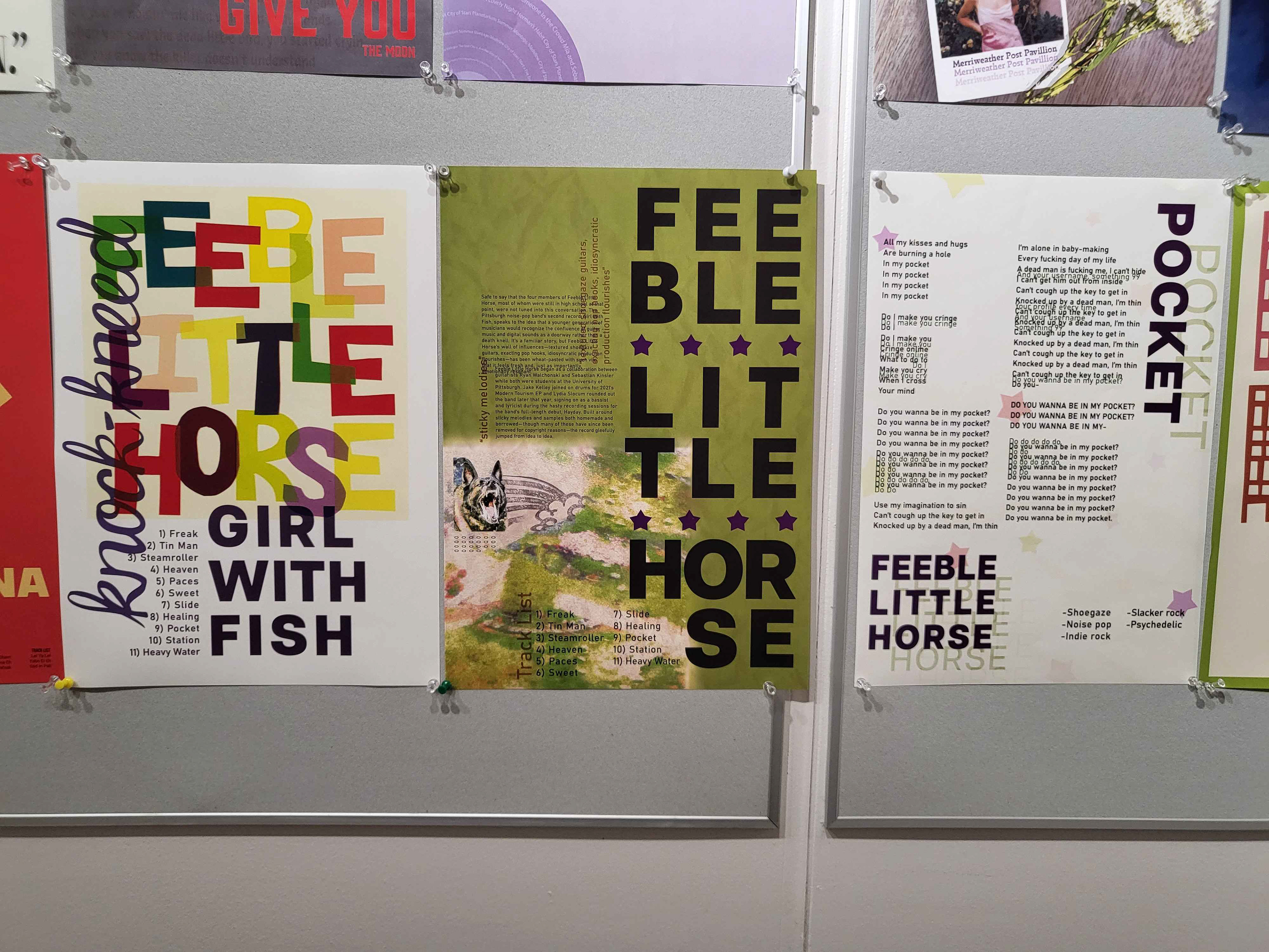
All 3 Displayed Together
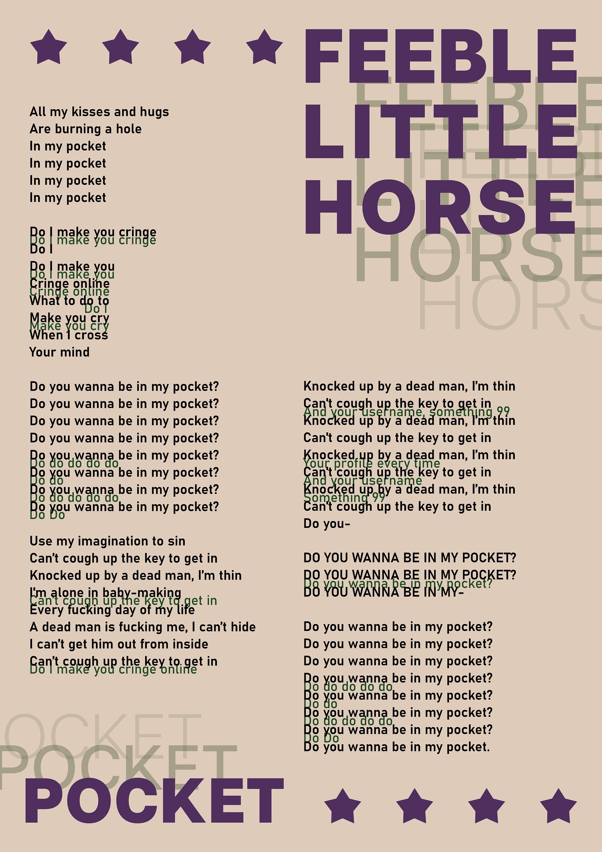
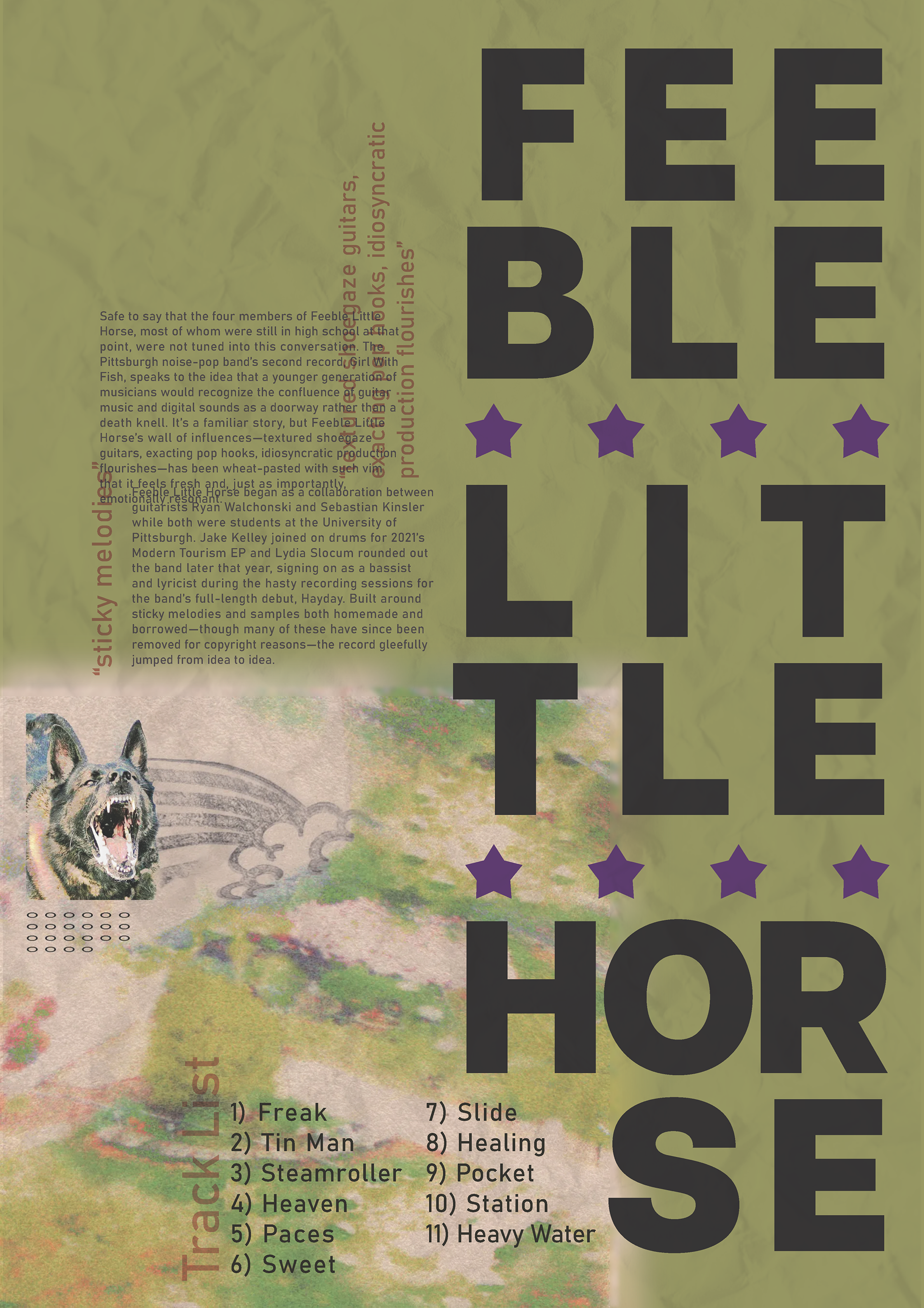
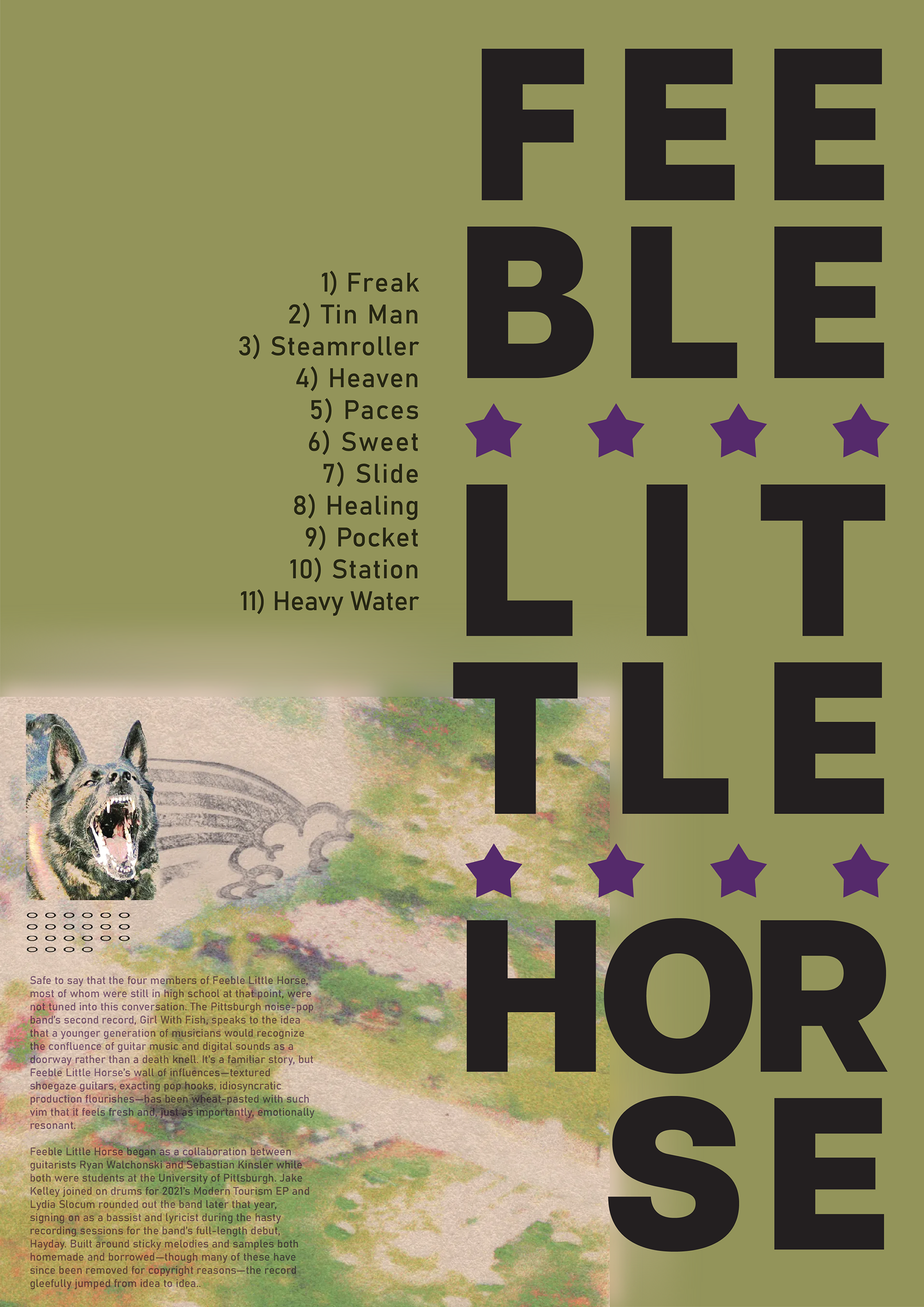
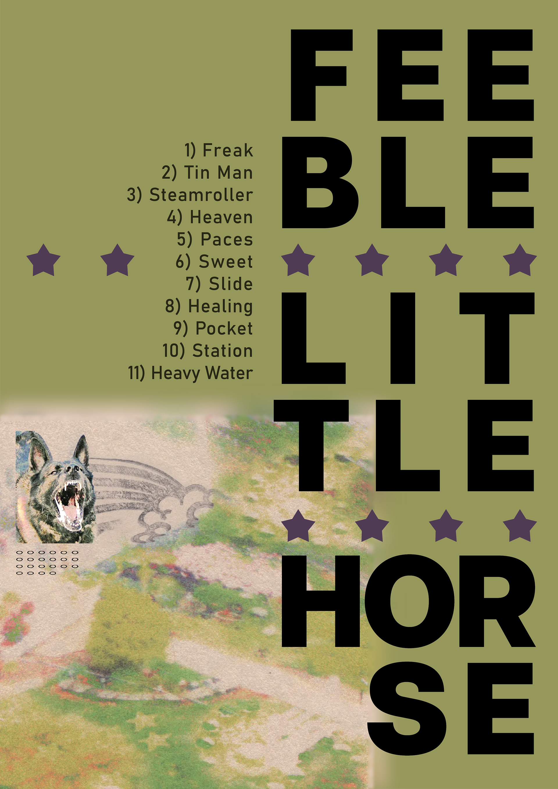
While iterating for my Type and Image poster, I began by importing my album cover and adding in the artist name in bold type. I then separated the words by using the star motif found in the album cover itself. I then needed to add more layers of type, so in came an album review and a song list. I also included a lot of overlap, which is a repeating motif based on the music itself.
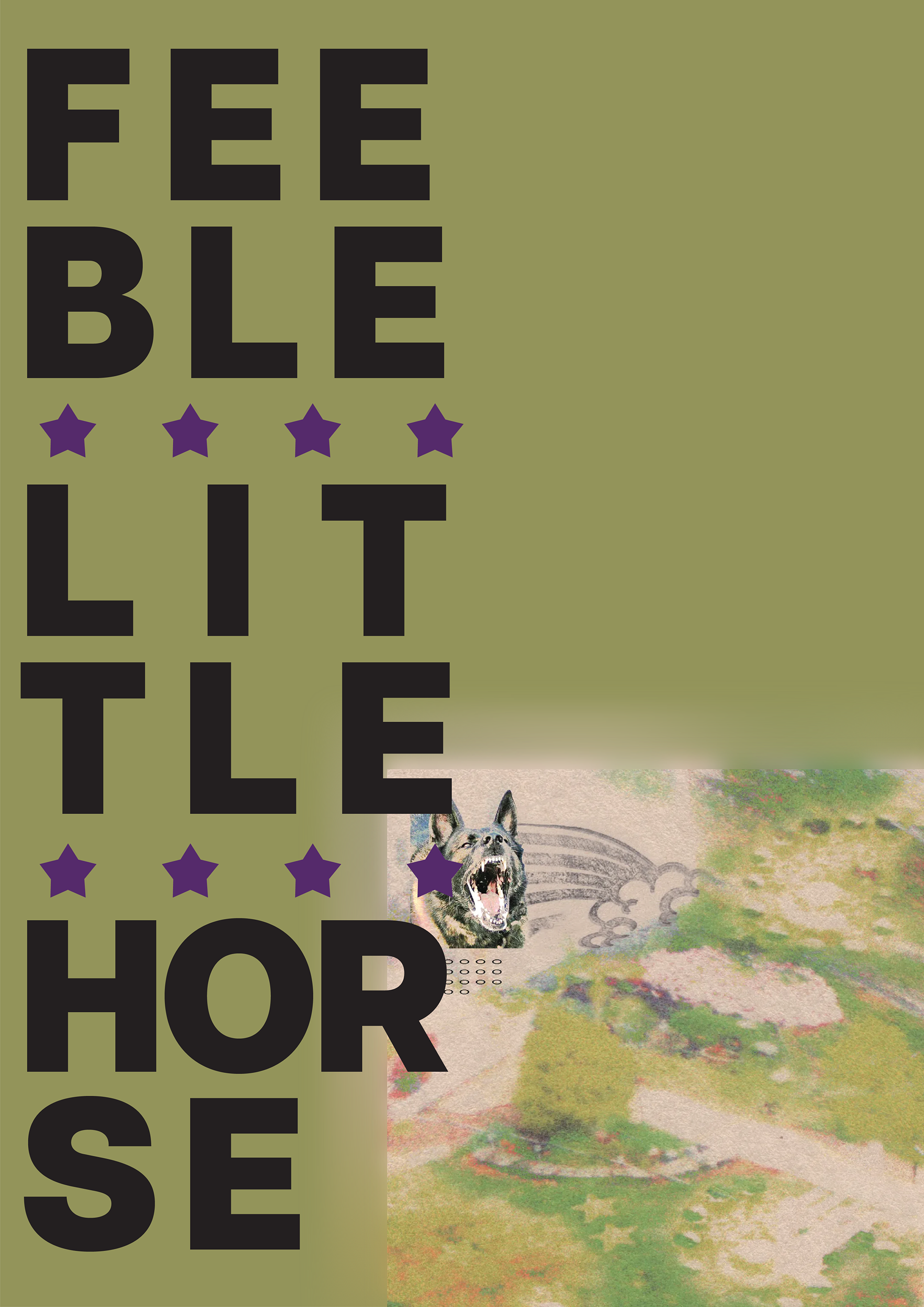

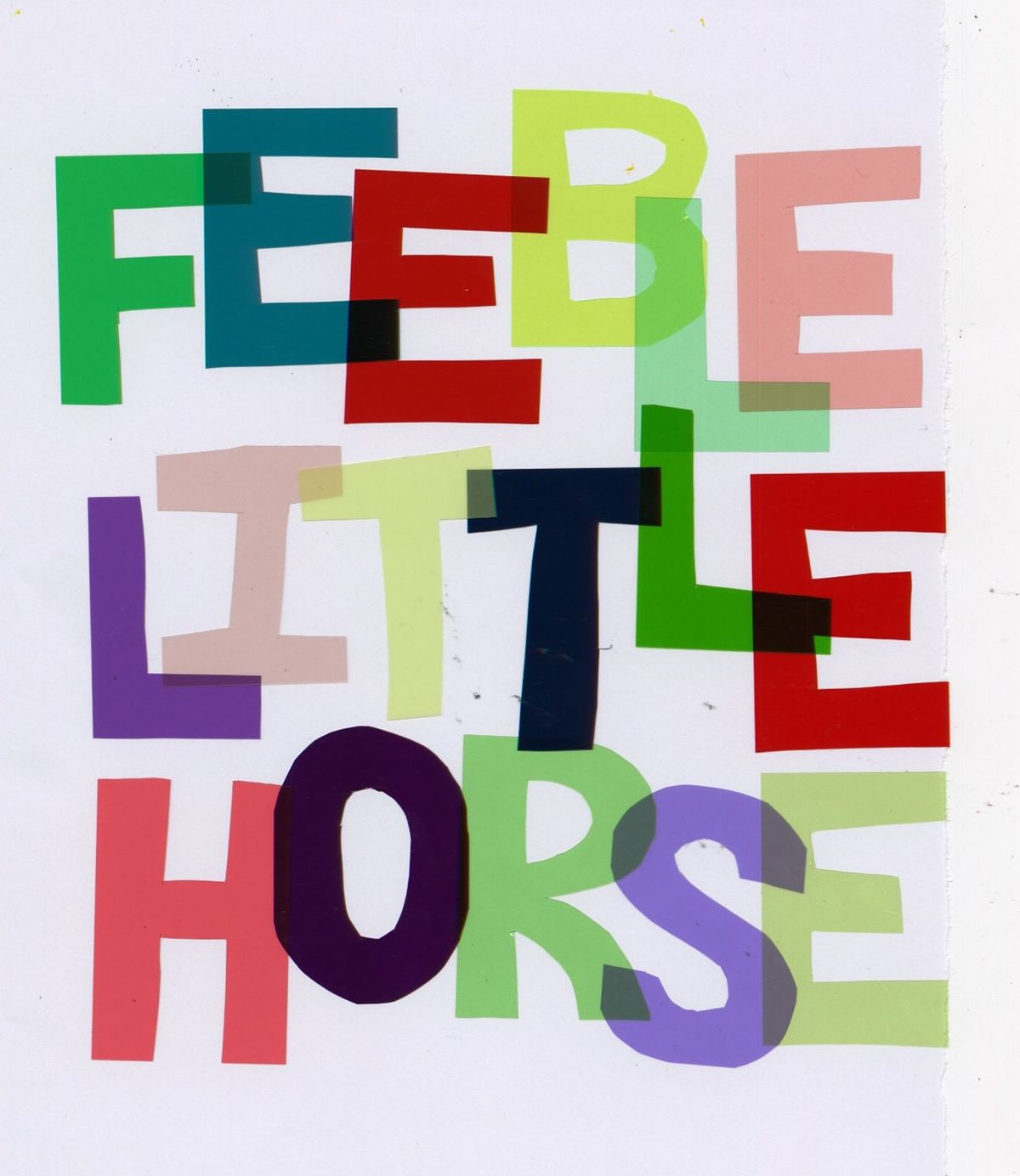
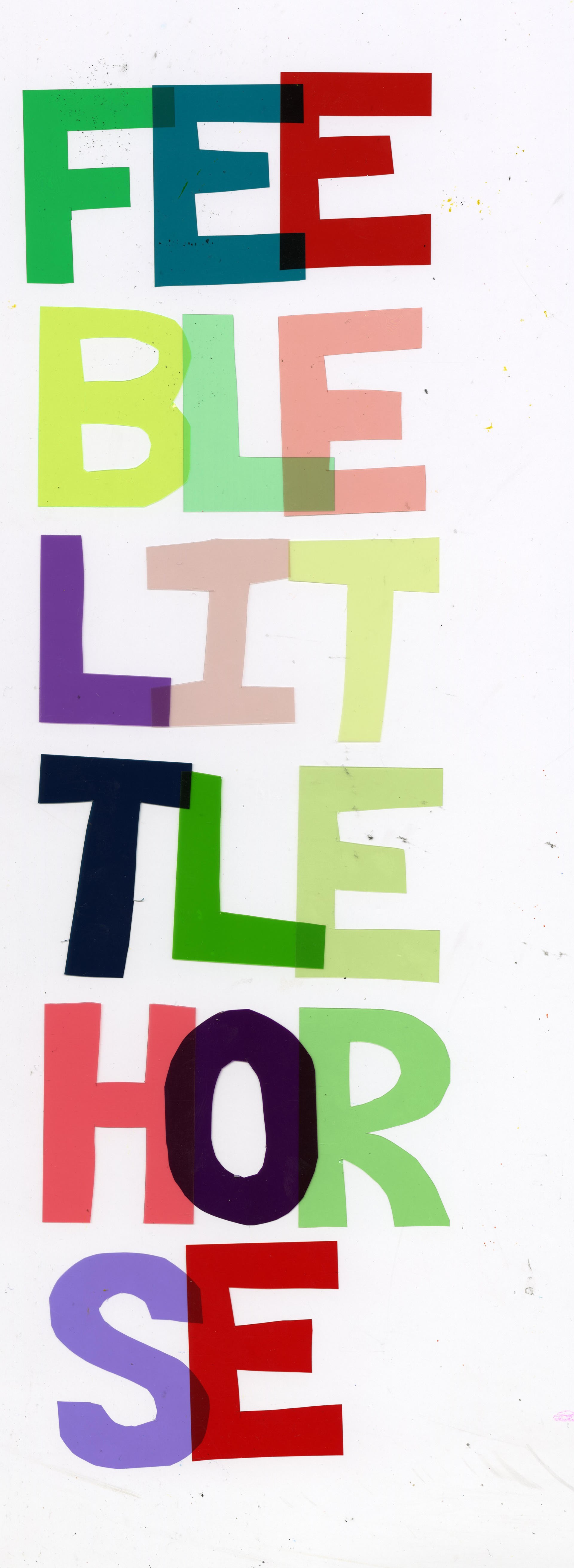
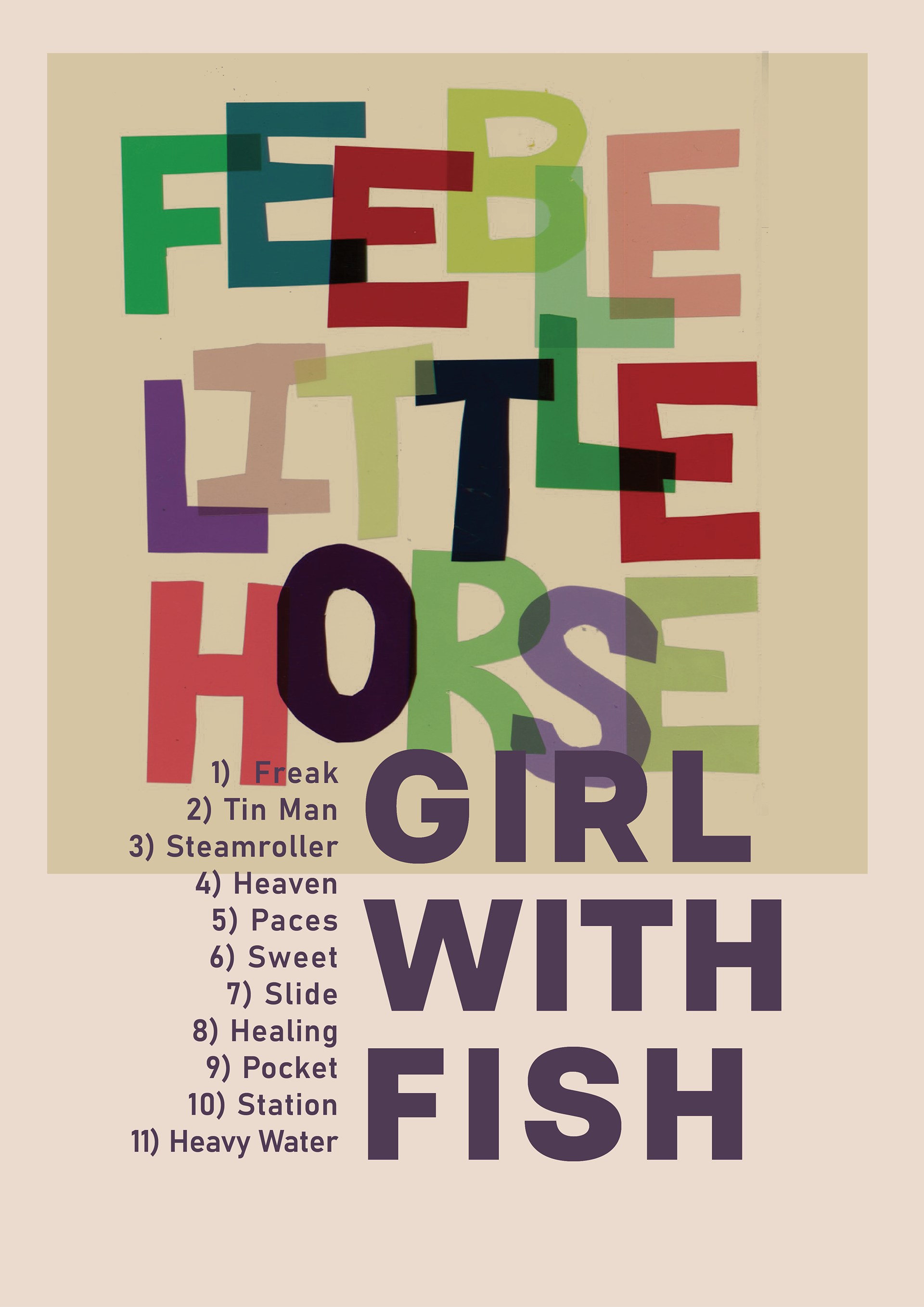
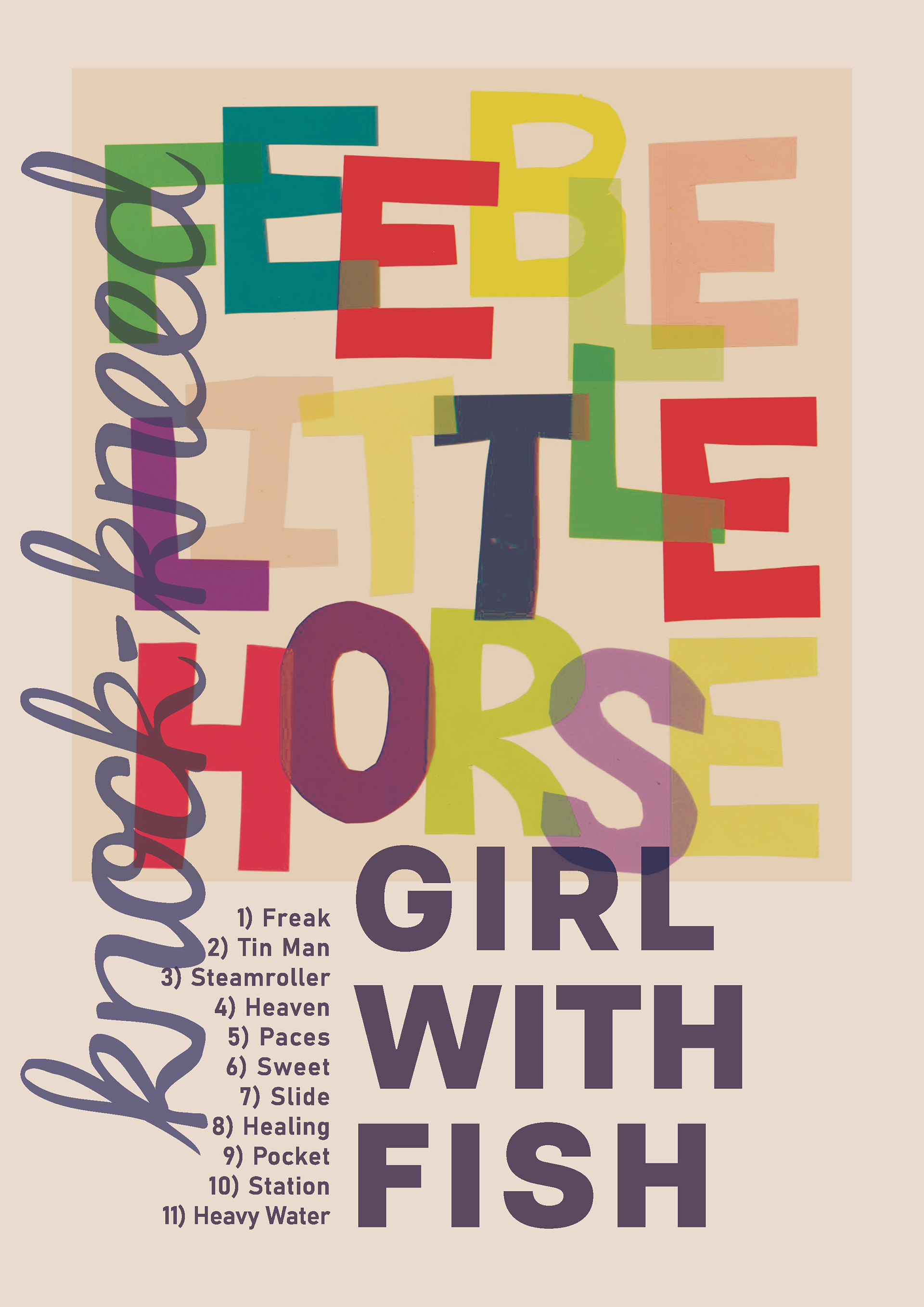
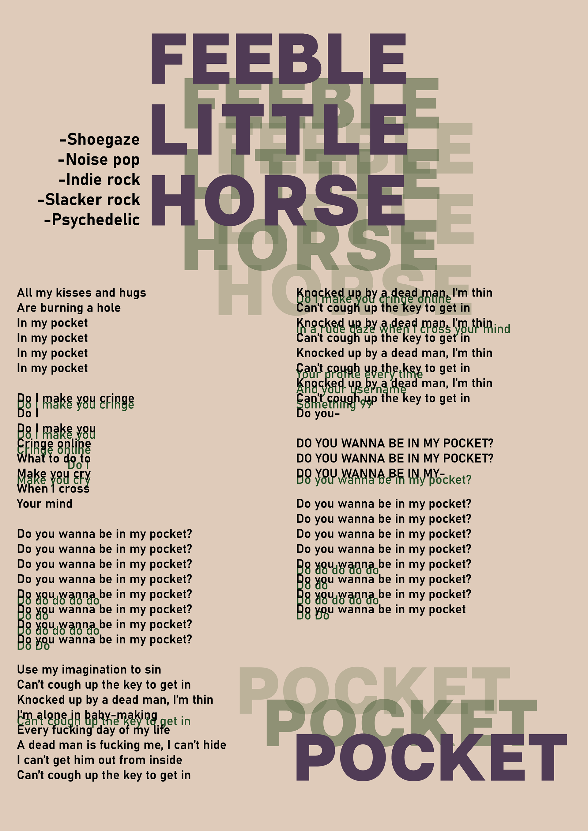
When working on type as image, I had the idea to cut out translucent colored plastic, originally used to color spotlights in theatre, to create color overlay using analog methods. I laid out a version with the words stacked as well as a version with half of the words stacked.
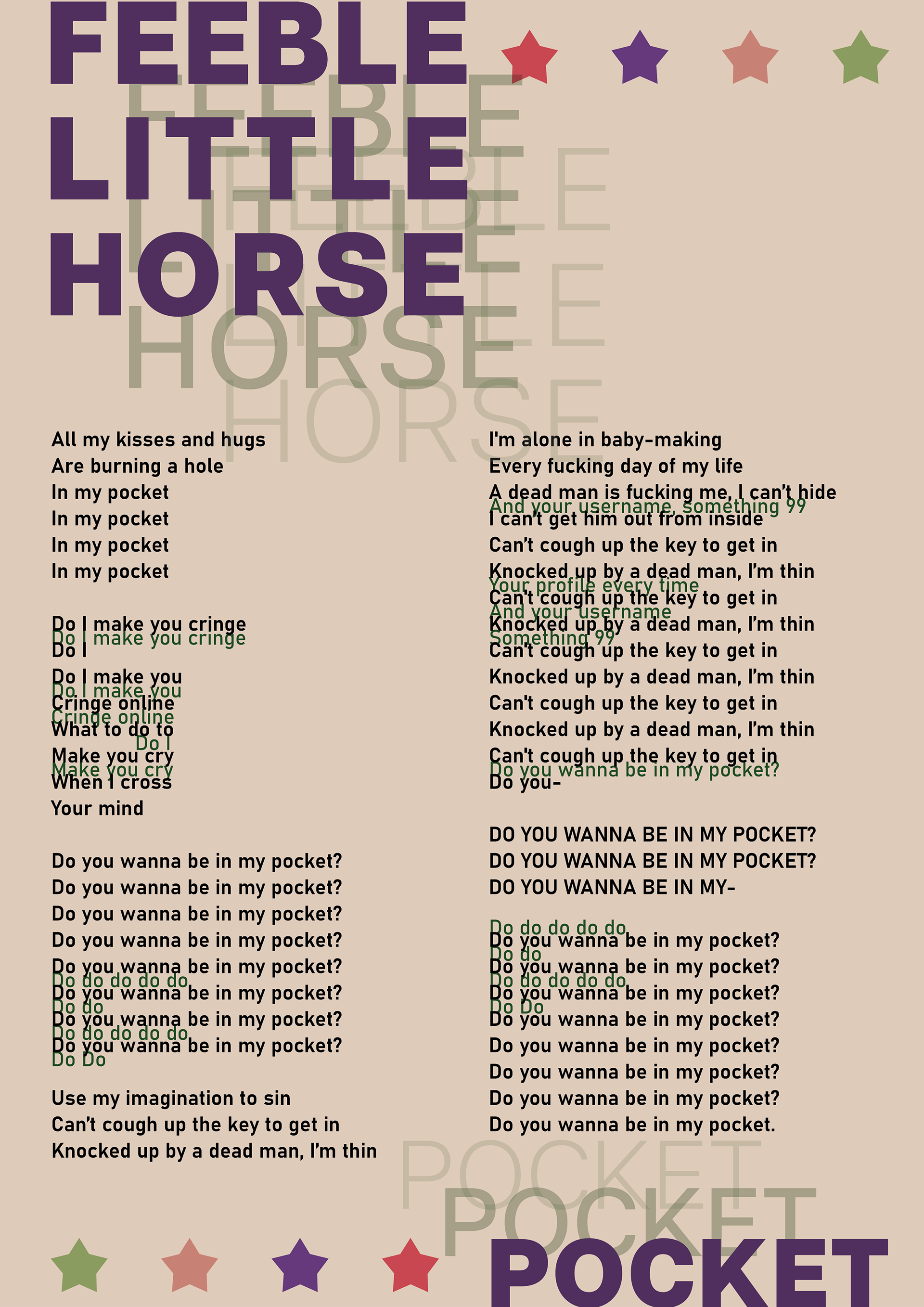
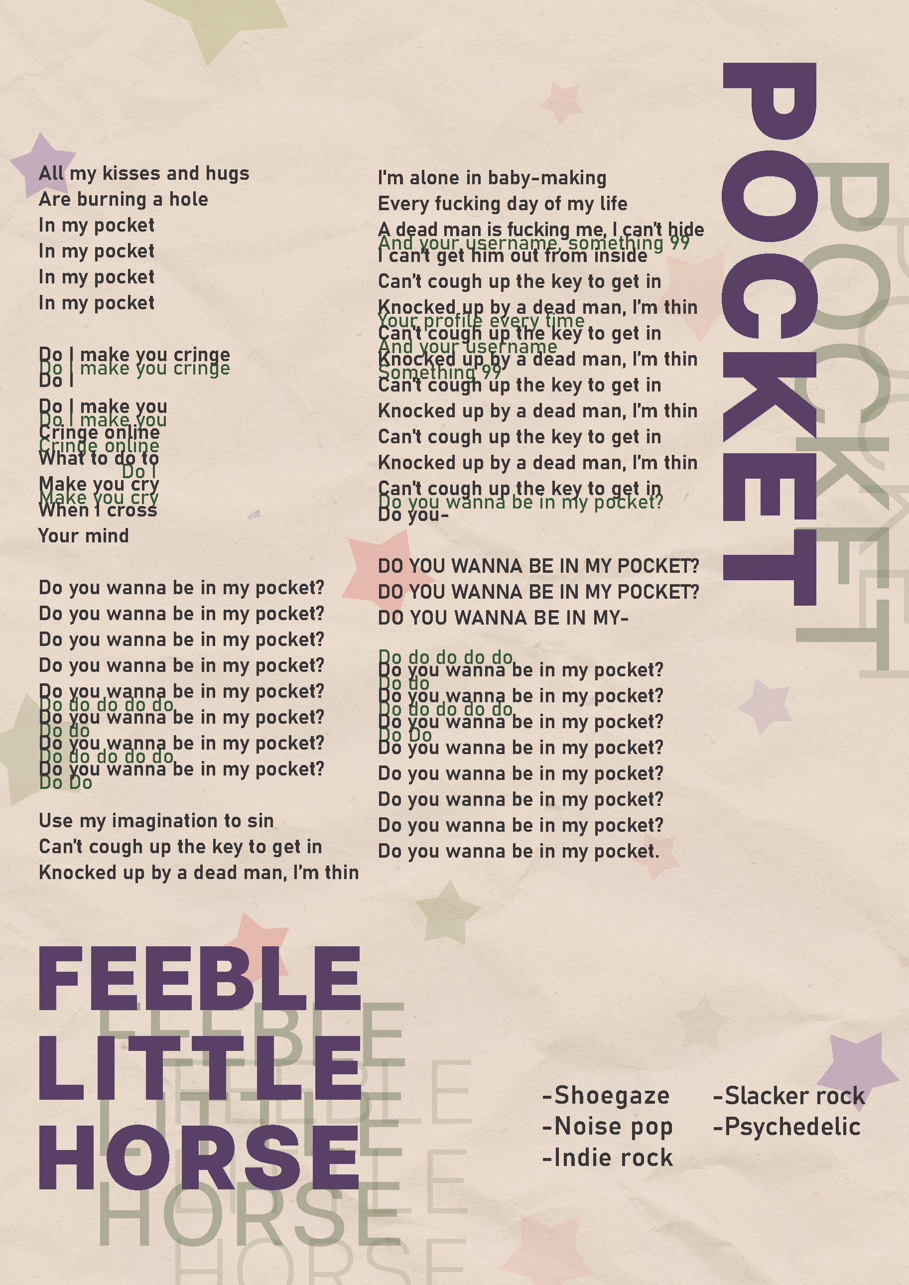
For my type as information poster, I wanted to focus on their song Pocket, and the overlapping voices in the song. This poster took longer to really find it's footing, until my professor suggested using the stars as more of a background element. Using the stars that way really lightened up the composition and made the colors and vibes match the other posters better.